Before and after
My role
I was responsible for the entire redesign of the platform, from UX to UI, along with managing design components
Along with tight collaboration with engineers on implementation and product managers on business goals.
Identifying the challenge
The platform has not been touched in over 6 years
Because there weren’t analytic tracking embedded, I have came to understand problems through conversations with engineers, customer success, and the product team.
- Lack of scalability — The existing design failed to scale for new capabilities and features we were planning to add.
- Visual noise — The platform mixed settings and features that customers had no access to, cluttering their experience.
- Inconsistent design components — There was an opportunity to unify the interface and establish consistent patterns across development.
UX decisions
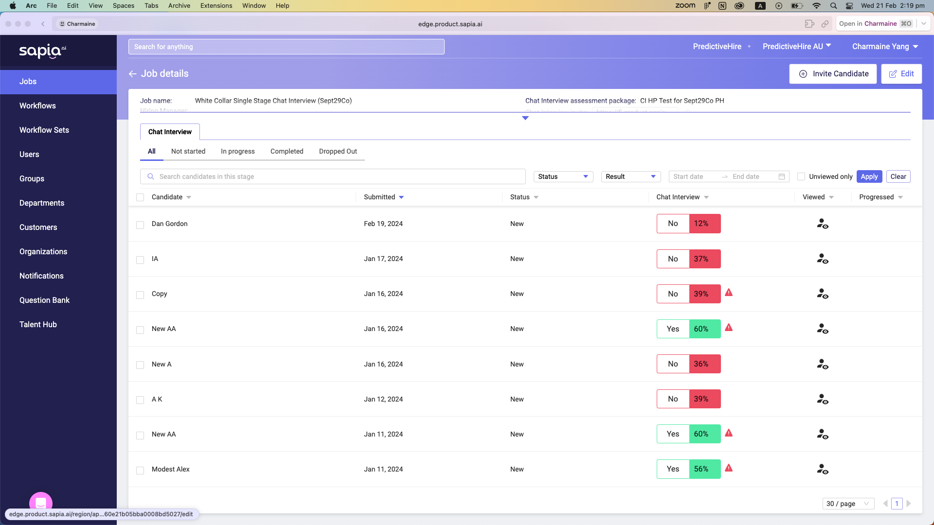
Viewing candidate reports is one of the most frequent tasks for recruiters and hiring managers on the platform, but the experience was very disconnected and full of friction.
Previous state: The process of viewing candidate reports and moving candidates forward required a back and forth between our platform and the ATS.
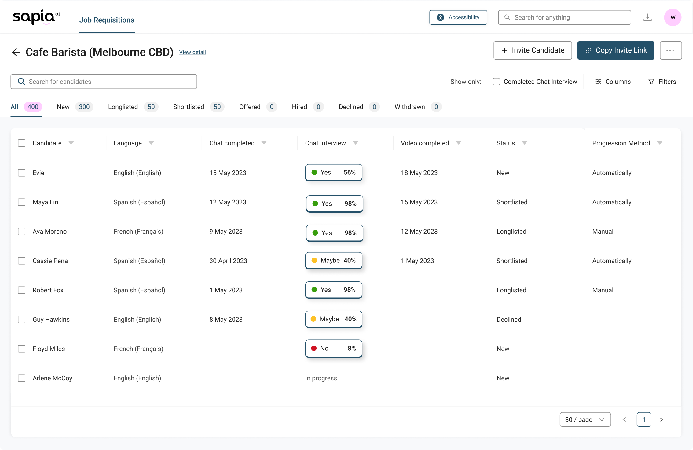
I have redesigned the experience for a more smoother flow, eliminating that loop with a persistent sidebar, letting users navigate between candidates in the same job without ever leaving the platform.
The sidebar design was something that I have iterated on multiple times.
Sidebar design
The challenge was to decide which key information to show on the left sidebar.
Hiring managers shift through hundreds of applicants per day. They need to instantly see which candidate deserves a look at.
The initial direction was to surface candidate availability front and centre on the sidebar, as in high volume retail hiring, shift availability is often the deciding factor. This however was ruled out after engineering flagged it as difficult to retrieve via the API.
With that constraint in mind, assessment scores became the natural priority to surface on the sidebar. The key design question was how to display video scores.
Sapia's video assessment feature supports multiple raters, producing two scores: the hiring manager's own rating, and the team’s average. The initial wireframe showed both, but visually, this as noisy and cluttered.
I did a few more explorations from the team’s feedback. After thinking through the actual workflow, I realised that:
Talent team members (likely hiring managers) who rate videos typically do it once and move on — they're unlikely to return to check their own score.
Decision makers (recruiting leads), on the other hand, care about the team average to assess which candidates to move on.
That being said, we couldn’t adjust what to show based on permission settings, but we could display important information in a simpler way. At the end, it was decided that:
- If hiring manager hasn't rated yet, show a "Rate now" prompt.
- If they have, show the team average score - the number that actually informs a hiring decision.
UI decisions
Pink is our brand colour, but didn’t meet WCAG AA standards. I decided to use our secondary brand blue as the main UI colour
While using pink and light blue more sparingly for highlights and illustrations to maintain a strong sense of brand identity.
Design system and accessibility
Ant design was used as the foundation for our design components, with tokens altered due to poor accessibility.
Design tokens were customised as colour contrast were low on certain components.
Final designs
Scalable UX
A few elements had scalability problems. For example, Filters used to sit above the table, which meant adding more would break the layout. I have moved them into a drawer cleaned things up and left room for future additions.
Less noise. More focus. Fewer clicks.
Hiring managers can now access reports on the right, browse candidates on the left, manage applicant status from the bar below, and all in a single screen. Fewer clicks, less back-and-forth.
Metrics: We have been seeing an average of 7000+ users navigating this sidebar per month. Highlighting the convenience it brings to them in the workflow.
Brand coloured illustrations used consistently across the platform strengthening visual identity
Previous platform used generic empty states. I have updated empty states with illustrations to reflect our brand colours, giving the product a more consistent, on brand visual presence. Open source library was used for efficiency and scalability.
Outcome
The final designs reduced clicks by up to 66%* for our customers, significantly boosting productivity their daily hiring workflow.
The platform is still present today with minimal maintenance needed as our product suite increases, reflecting the success of the project, particularly the strategic design considerations made early.
Moreover, after release, we added new configuration pages and dashboards, which integrated seamlessly thanks to the consistent component patterns and page structures established during the redesign.
*Evaluated based on navigating an insights report and progressing them to the next stage
Designs are never just ‘done’
We have embedded analytics tracking on our platform to ensure we provide the top quality for our customers. These data are tracked to inform us how users are using it, and serves as a data for future improvements.